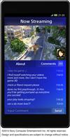
Screenshots of the PlayStation 4 user interface
posted:
2/28/2013 5:35:00 AM
More On:
PlayStation 4
Here are some screenshots of what the interface could look like on the PlayStation 4. I say could because it's subject to change and given the amount of time before the launch, there's a good change things can be tweaked here and there.
Some of the screens reminds me of the Xbox 360 interface with a Metro UI feel to it. Others should look familiar if you watched the PlayStation 4 unveiling as they are the same screens shown at the press conference.
There are a few mobile UI interfaces shown here, both for the phone and tablet. It looks like you'll be able to watch your friends playing a live stream through a mobile device, which is pretty cool and something I'm doing now with Twitch.TV's Android app. It seems you'll also be able to comment on the person's stream live as well. You can see Sony's push for more social interactions here.
To me, the interface looks clean and easy to follow. E3 will be my first chance to see it up close so I'm excited to go through the UI and experience the new design to see if it's easy to navigate and easy on the eyes.
Source: Kotaku


