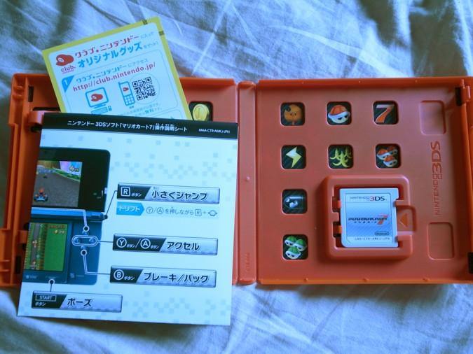
Mario Kart 7 makes use of green packaging in Japan
posted:
12/7/2011 10:35:00 AM
More On:
Mario Kart 7
I guess that it is time for us all to get used to the “green” packaging that publishers are using now days in order to help the environment. I am not exactly sure how much benefit the world gets from them cutting out a portion of our game cases but it probably makes a difference when you take into considering that millions of copies of these things are produced.
Anyways, Nintendo is taking advantage of the new case designs to emphasize the art of its games, at least in Japan. The Japanese version of the recently released Mario Kart 7 features inside cover art that fills in the blank spaces that appears as bland voids in the rest of the world. I have to admit, the resulting design is pretty sharp and something that I would like to see more companies take advantage of in the future.
Take a look at the Japanese box below and let us know what you think...
Source: TinyCartridge
