Gunslingers & Zombies
Gunslingers & Zombies started its life as a PC release last year and has risen from the dead here on Switch. It should have stayed in the grave.
Not to say I am wishing this game was dead. I don't. There is a decent, if simplistic strategy game in it that looks good and offers some moments of fun. But it should have just stayed on PC. My very first impression was poor when I entered the title screen and couldn't use the d-pad buttons to navigate the menus, only the joysticks. Let's take the most fiddly and unimpressive stick in the entire Switch hardware ecosystem and dedicate our entire navigation to it... Then I tried to jump into a game and was greeted with what must surely be the worst font size I've ever come across on the native LCD.

I've complained about this in reviews before. It's a bugaboo of mine. If you port a game over to the Switch, expect players to settle in on the native experience of playing your game on a screen barely larger than 6 inches. You can't just slap your unaltered PC menus into that space and expect people to squint. But this was egregious. I measured. Individual letters were less than 1/16th of an inch across the screen. Even with my new glasses it was hard to make out the text, impossible without. Now space out four pages of written dialogue before actually jumping into the game with the tutorial - it's a nightmare. In game things are no better. “There is a box with bandages on the board.” was written across the screen in a live mission intro. The entire sentence took less than 1.25 actual inches on the LCD. That's less than 0.03 inches per character. What is this, a game for ants?!
Early in I had wanted to pick up and play during my lunch hour before heading back to work. However, I realized I had to climb a flight of stairs first after turning the game on and realizing my glasses were in the basement office. This is the only game I own on any medium - PC, console, or even mobile, that is unplayable for me without eyeglasses. Can’t even figure out a single digit numeral for the weapon damage without them. I gave up that afternoon and just read the news on my iPad; the fonts were better.

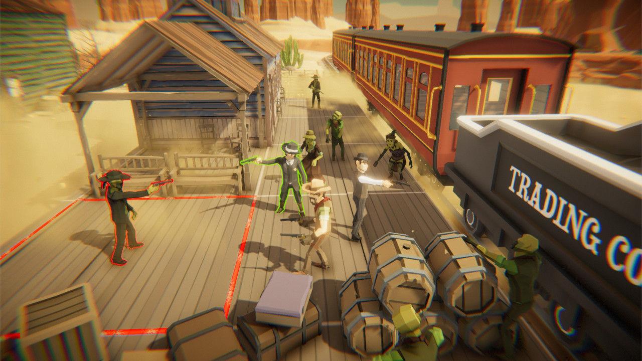
So we are smashing too much information into too tight of screen real estate, what else are we not utilizing? Well, the d-pads as already mentioned; and the touchscreen, no support there. And there is no undo button - and I'm not even asking for a gameplay crutch here, but it is far too easy to use up a precious action point simply by mis-clicking on a map tile when only trying to change focus to new character. So instead of a character select, we just sent the previous one ambling toward their partner in a decidedly un-strategic move, a cardinal sin in a "strategy" game. And in some weird twist of fate, selecting tiles when you actually intend to can be an irksome task as the camera orientation has a lot more to do with what is and is not selected than actual intuition when dealing with too many objects trying to occupy too small of a space.
What I mean is, sometimes you have to rotate your camera around and round just to actually get the cursor to highlight your intended target, no matter how unobstructed it may appear from other angles 90 or 270 degrees apart. Kinda feels like something a d-pad would sort out, doesn't it? I also longed for a menu screen button from within the game until way too long into playing. I was convinced until halfway through my play through that there was no way to quit to the main menu without manually closing and re-loading the game until two days later when I accidentally clicked an unintuitive pause icon set next to the intuitive plus icon that actually did pause the game. Pause twice for menu? I’m not going to try and better explain it because it’s all very stupid.

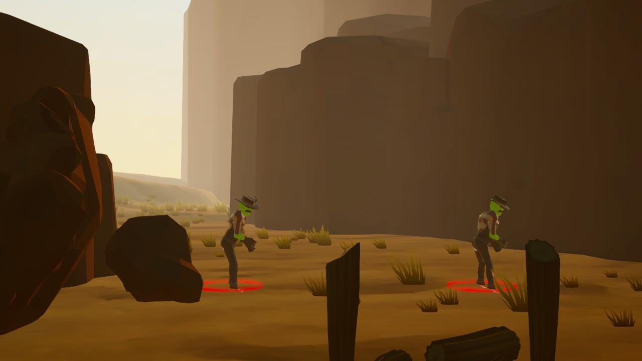
There are other features that are clever, but poorly implemented. For example, you can highlight, but not click on an enemy zombie. So you can hover and see movement range for the next turn, but if my character if offscreen, I can't actually keep that range in detail as I track over to my units to understand if they are on the edge or just out of that range. It turns a good feature into a frustrating one. There are two Chapters to play through, with 5 levels in each, but no continuity map to map with the characters in Chapter 1. Each is just a standalone challenge with a rotating cast. Chapter 2 does try to achieve character continuity, but fails by making levels overly big with no ability to actually scale the 3d window dressing. Everything is bigger and bolder and actually looks really good in Chapter 2 but none of the 3D objects, be it buildings or canyons or mine tracks, are actually scalable despite the presence of well placed ladders and paths that would make it appear they should be. The grander scale also makes finding the needed camera angle to actually select characters and targets all the more difficult. It looks good but plays bad in tight spaces with obscured views.
Gunslingers & Zombies is very good at introducing new concepts, enemies, items, chests, supplies, etc. Credit is due there. It is not always explicit in how to defeat certain challenges, but clearly lays them out as mission objectives. For example, no instruction was given as to how one might actually stomp out your first spawning nest even though it is a core mission objective. It's not too hard to figure out you need to use one action point to move yourself next to the door and another to kick that door down and clear the room. What would have been more helpful would have been to clearly place a tile marker next to the door to make it obvious this is where I need to stand, just like the mission exit tiles at maps end. But it was manageable and overall a new variable is introduced with each map in an appropriate drip-feed.

What fails to tie it all together is eliciting any sort of investment from the player. The rotating cast through Chapter 1 makes it clear the game is just a series of unconnected, standalone strategy puzzles. Trying to tie together things in Chapter 2 fails to hit the mark. Why are my cowboys even here if they don’t know what they are doing or why they are doing it? I later realized that the plot was trying to play out in the all too tiny intro font during the loading screen. But I can’t be bothered at this point to give any credence to such a lazy storytelling device.
Also, the weapons are underwhelming. Zombie variety is decent, although limited to only a few forms. But all of the weapons are pretty much worthless except for the Winchester rifle. It has the best range, best stopping power, and largest clip. The Winchester is OP across the board and is the only weapon that can reliably one shot most typical zombies. So whoever holds the Winchester becomes the only important character. And don’t get me started on shotguns. Two rounds, no area of effect, and doesn’t have stopping power or range better than a pistol? Everything other than the Winchester feels like artificial difficulty through poor loadouts - loadouts you don't choose but are pre-determined and vary map to map. And that's the other way chapter 2 fails to tie anything together, because even if I could read the loading screen font, none of my actions from one map have any determination on the next. Run out of ammo, lose a character to the icy grip of death delivered by the decaying hand of the undead - no worries mate, they'll be right as rain as soon as you hit the map exit and load the next mission.
So what do we have? Well, we have one misleading trailer that's for sure. You don't really "meet different characters" because they just swap out with no character development. You don't "manage your crew" because you are assigned a pre-scripted load out. The closest to "manage" you are afforded is when you decide who opens the ammo crate, and it had better always be the one with the Winchester repeater. The other claims are less-dubious and you do enjoy Wild West landscapes.
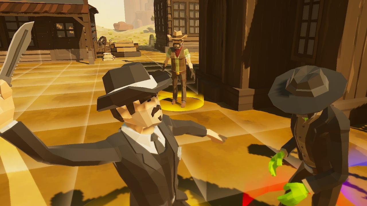
As for the Mii character style, the game does look pretty good, but mostly does so in the cut scenes executing actions, not during the tedium of dizzying yourself spinning the map to find just the right angle to actually input that action beforehand.
Gunslingers & Zombies is decent in gameplay, but really lets itself down in the presentation and - outside of the 10 levels - not really much replay-ability either. I was tempted to actually give this game a break on the score given the price point - it's a $9 strategy game. But when I think about how poorly it was ported over, and then I look over on Steam to see it's actually cheaper at full price (and frequently on sale) for what must be a superior version, I realize that the price point is actually about 3 or 4 bucks too high. Gaming Nexus score guide lists a 5.5 for "Mediocre" and that feels about right. Do yourself a favor and pick up the PC version if you're really interested in this one. It's not a terrible game, but shouldn't be on the Switch if it wasn't going to get the care it deserved to actually live here.
Gunslingers & Zombies gameplay and visuals are better than this score would suggest. It's just let down by awkward controls, worse camera angles, and other evidence of a generally uninterested PC port. There's a better game out there on PC that might be more fun than paying more for a Switch version that really didn't care enough to take advantage of anything that makes the Switch good.
Rating: 5.5 Mediocre
* The product in this article was sent to us by the developer/company.

About Author
First picked up a game controller when my mother bought an Atari 2600 for my brother and I one fateful Christmas.
Now I'm a Software Developer in my day job who is happy to be a part of the Gaming Nexus team so I can have at least a flimsy excuse for my wife as to why I need to get those 15 more minutes of game time in...