Two Point Hospital
Management sims have always had a special place in my heart. There's something about taking a whole lazy Sunday and relaxing the day away building my very own farm, colony or hospital. Back in 2018, I stumbled upon Two Point Hospital for the first time while watching the 2018 PC Gaming Show during E3. This initial glance at the game piqued my interest immediately. Even in a short five-minute demo, the charm of the game was apparent, and it quickly went onto the shortlist of my lazy Sunday games.
Life moved on, but I eventually found myself with a free weekend and an itch to visit Two Point County, so I set out on my first adventure as a hospital administrator. For the initial PC release, I spent a little time with the game but it eventually fell by the wayside in favor of new releases. Throughout the past couple of years, I've revisited the game a few times when the itch came back around but never got to finishing it. With the release of Two Point Hospital on Switch, the itch came back with a vengeance, and I dived in as soon as I could.
For those new to the game, here's a quick breakdown of how it works. You play as a hospital administrator in Two Point County, assigned to manage a foundation's hospitals throughout the county. The game is comprised of scenarios, each one giving you a new hospital to build up in a different part of town. Early on, the hospitals are designed to introduce you to the core mechanics, such as room building, staff management, treatment, and training. Once you're through the introductory hospitals, the game ramps into more challenging hospitals which require more adaptability.
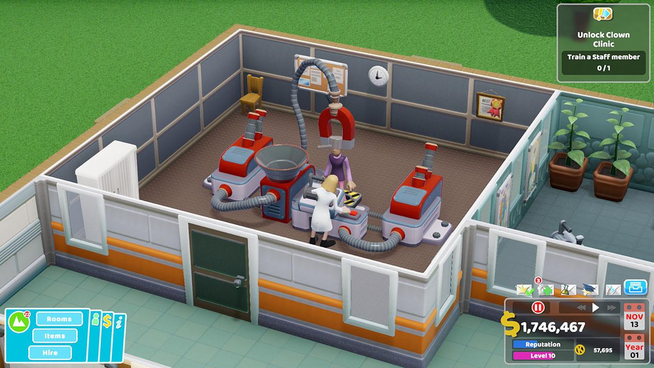
Two Point's best feature by far is its writing and environment design. Tonally, the game takes a slightly humorous approach to healthcare, and it hits just right. Most everything in the game elicits at least a little smile from me when I'm playing, whether it's hiring a doctor named Isabelle Dynamite or hearing the PA system broadcast, "Announcement! Try not to die." The humor and tone are perfectly consistent across the scope of the whole game, which kept me excited to move from level to level, just so I could see what silly sicknesses and creative treatments came next.
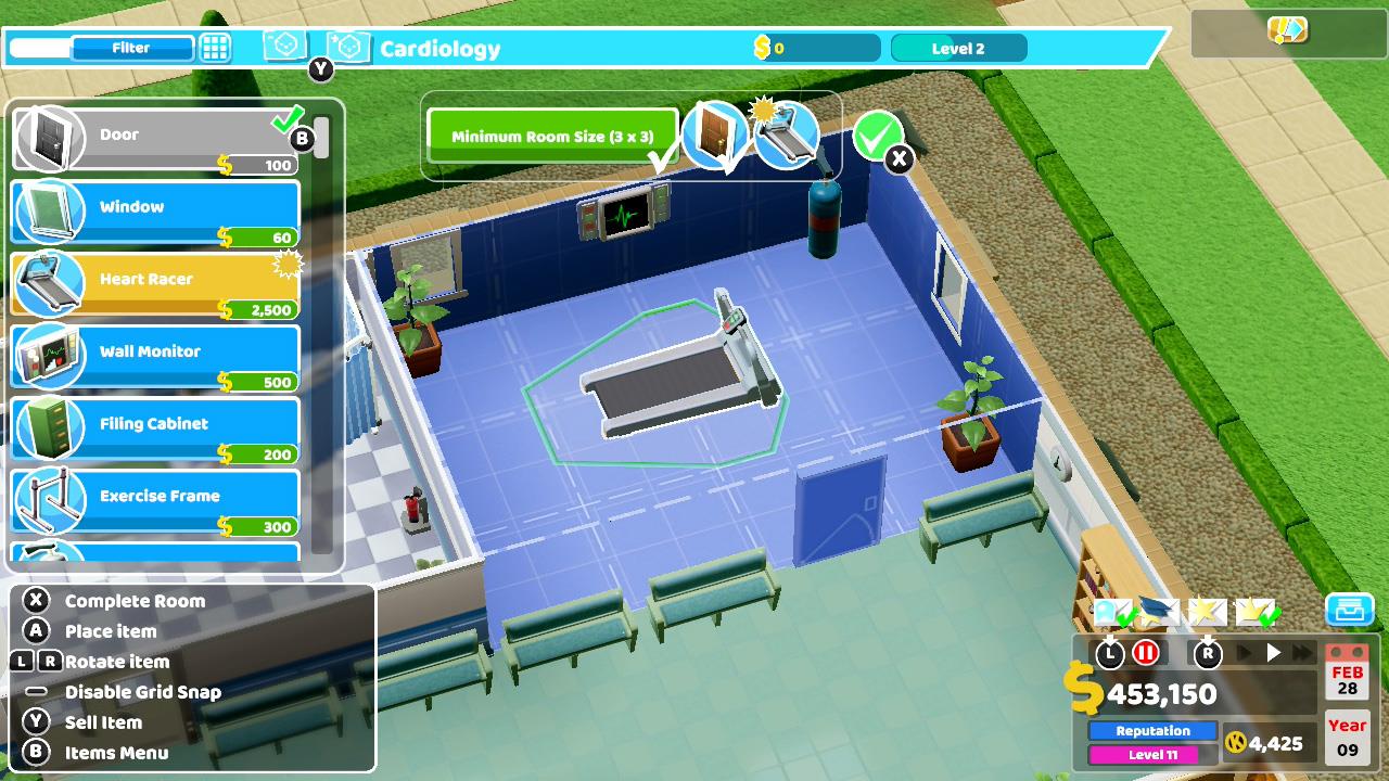
As far as management sims tend to go, one of my main concerns was that it would be hard to do all the building and management on a console. Two Point handles the controls excellently, giving quick tutorials to nail down the room building and menu management. They also leave plenty of visual clues in the appropriate parts of the UI, making it easy to relearn the controls if you forget a keybind or two. Placing objects was easy and consistent, despite the game's pretty complex grid system. After an hour or so, I felt like I was making rooms and navigating the menus just as effectively as I could on PC.

Graphically, the game is scaled down a bit from what you would expect on the PC version, but it still looks great. Even playing undocked on the Switch, the game looked good and I rarely had issues identifying smaller objects in my hospitals. Two Point's claymation-like art style is great in its own right and feels right at home on the Switch.
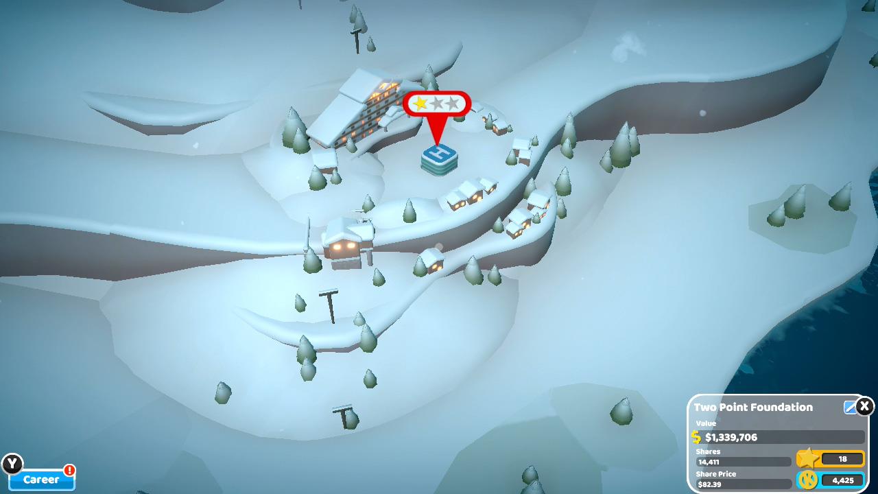
At its core, Two Point has a strong gameplay loop. In essence, you work in a hospital, increasing its rating by completing challenges. Once you get a hospital to two stars, you can start the next scenario or stick with the current one to push to three stars. The best part of all this is that your current state on each hospital is saved for posterity. Even if you're working on the sixth hospital, you can always hop back to the first one if you want to improve it. This piecemeal style of play is extremely well suited to the Switch, where I could focus on knocking out a single hospital in short sprints.

The pick-up and put-down nature of the Switch pairs well with the structure of the game, and even helps to offset some of the game's more frustrating pain points. This leads to my biggest complaint about Two Point Hospital as a whole. Despite the various challenges each hospital presents you with, the process of building up your hospital can tend to feel too repetitive after the third or fourth hospital. Hospital creation is fairly regimented at the beginning, and the pacing can feel rough when moving to a new hospital slows down the game all over again. On PC, this factor was one of the things that made it hard for me to play the game for extended periods. The cycle of going from a flourishing fast-paced hospital to another slow start was extremely jarring. This pain point still exists on Switch, but I think it feels less frustrating simply because I don't generally play my Switch for more than an hour or two at a time.
Performance-wise, I was pleasantly surprised by how well the game runs. I was concerned that performance would suffer during large hospital scenarios, but it ran smoothly through everything I hit it with. Saving and loading times are somewhat long, but not too bad. The only in-game issue I ran into was year advancement. At the end of every year, there's an awards ceremony for the hospitals, then it moves to the next in-game year. Upon doing that, my game would generally hard freeze for 3-4 seconds with no real indication of what was happening. Not a great feeling, but also not the end of the world.

The game's design, art, and simplicity make it a near-perfect Switch title. It's easy to learn, easy to play, and suffers only a few issues that detract from the overall experience.
Rating: 8.5 Very Good
* The product in this article was sent to us by the developer/company.

About Author
A Quality Engineer by day, I spend most of my remaining time playing whatever games I can get my hands on. I enjoy almost any game, but I'm preferable to looter shooters, action RPGs, and pretty much any sci-fi or fantasy game with a halfway decent story. Some of my favorite franchises and games of all time are Dead Space, Knights of the Old Republic, Stardew Valley, and Sniper Elite. Despite the fact that I'm not overly competitive, I'm passionate about esports and love watching any esports events I can find in my free time.
View Profile