Budget Cuts 2: Mission Insolvency
I did not play the original Budget Cuts. It wasn't until the review for the sequel landed on my desk that I had even heard of the game. So I did what I would always do in such a situation and dug into the first for some background and context. What I found flying under the radar was what appeared to be a very good attempt at a game with a delightfully unfolding storyline that unfortunately suffered under the lofty weight of its own ambition. I was excited to get to dive into Budget Cuts 2: Mission Insolvency because all of the pre-release press was promising this would be the fulfillment of that ambition. And if you want to skip all the words between now and the conclusion I'll give you the spoiler up front: it is. Budget Cuts 2 absolutely delivers on the promise and premise of the first game, but it isn't without its faults.
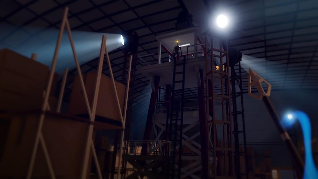
World building is so important to me in all games, but probably even more so in VR. I want to get lost in the environment presented to me. I want to believe there is a larger world just beyond the walls of my own experience. First off I need to mention that Budget Cuts 2 absolutely delivers on this end. There are many ways that the bigger picture creeps into the more narrow play through. News announcements on the television, characters, even the decor of the environment all speak to the larger narrative, and harken back to the original. Having not played the original I most assuredly didn't catch every reference but I'd rather not belabor that point. Not will I belabor it when I note that the game also packs in an excellent sense of humor. I've heard that the original was even more dead on this mark but Budget Cuts 2 also does well to keep the adventure filled with gags and chuckles. The virtual world for Budgets Cuts 2 is fleshed out and immersive, plaudits on that front.
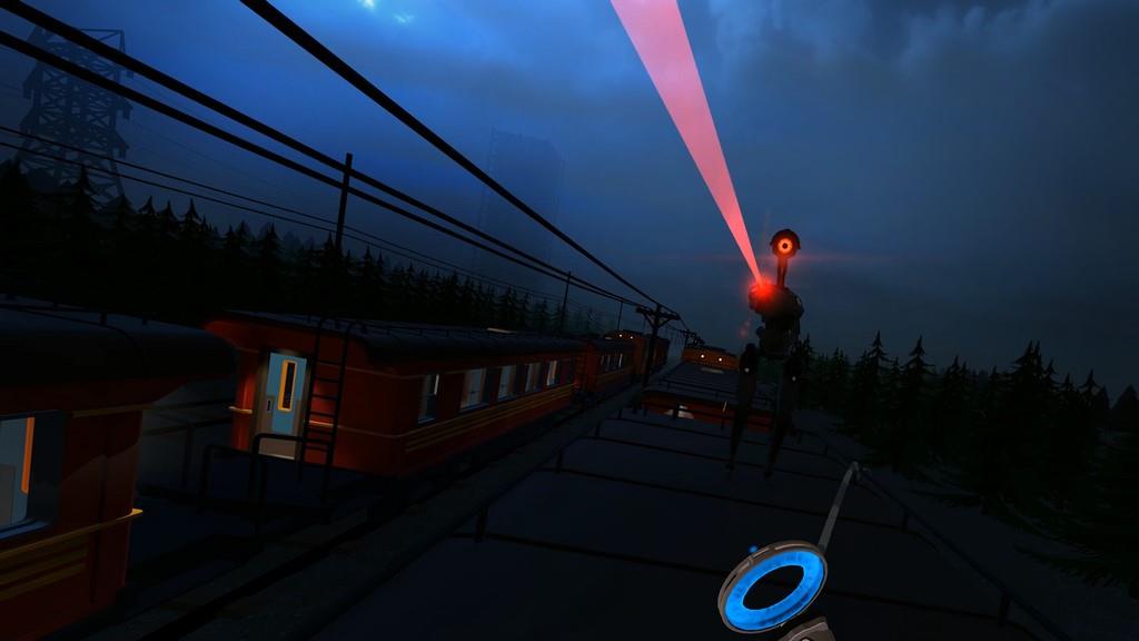
Where cracks start to appear is not in the world Budget Cuts 2 has built, but in the way it unfolds the story within that world. Quite simply it takes a lot of shortcuts in level progression that simply felt cheap. The best example I can think of comes in the very opening level. Progress all the way to the front of a moving train, sneaking around, avoiding robots, collecting weapons, taking a few out, and finally arrive at your destination only to find a locked door. They key - a key code, the location - <<makes shrugging motion>>. Neither the NPC partner that rings in to drive levels forward through your headset nor anything in the environment provides any direction as to where the code is or what it might be. You are simply instructed to "search for it" and left to backtrack through the entire level with basically no clue to even narrow that search. You might call this a spoiler, I call it a favor, the damn code is on a post it plastered on the back of the head of one of the non-aggressive robots you passed, or even skipped past like I had, along the way. Yes, the back of the head of a robot whose AI instructs it to always be looking at you. It is neither intuitive nor easy to either spot or actually retrieve. It's just, in my opinion, bad design; and drops itself squarely into the very first level alongside the first impressions of the game. But please do give the game a chance past this initial transgression, there is so much more to offer beyond that locked door...
As far as game mechanics go, we're again back to Budget Cuts 2 strengths. It takes a minute to get used to the controls, or rather to get used to swapping in and out of the different tools at your disposal, but once your there you're set. Interacting with the environment is mostly fully intuitive and responsive. While one particular tool, the magnifying glass, is mostly useless, others like the portal gun used for locomotion are simply brilliant. Room scale is supported for fine grain positioning, but the vast majority of your movement is going to be dictated by that portal gun. This is where the game becomes something akin to portal meets Garry's Mod. You use the gun to launch a little blue ball onto various parts of the levels. Once it lands and settles you get a window into this new location. You can step through this window and teleport yourself there with the press of a button, or use it to see around corners, or quickly back out if you meant to step up to a ledge but then realize through the window the place is swarming with guards. It's a two step process with many functions and keeps locomotion an integral part not just of game play but game strategy as well.

The rest of the tools and weapons are all similarly dialed in. Where the gloss comes off is when your own arm is meant to be the weapon. Out of the gate or when you're out of ammo for things like the bow your primary mode of defense is tossing objects at the various guards or opponents you would like to overpower. You can smash them with coffee mugs, or dart them with sharp objects like the bounty of throwing knives inexplicably littering the landscape. The problem is, it takes an incredible amount of force to actually hurl a projectile. The kind of force where you don't really feel safe swinging your arm at that speed in an enclosed space with a wraparound LED covering your face obstructing your connection with the outside world. Look, I know my play space is clear, but I still don't trust flailing my arms that wildly when there are objects lurking just outside the bounds of my room scale setup. That alone is unsettling, but compounded by the feeling that I was never confident the game was accurately tracking my throws anyway. I've been throwing things all my life, from tantrums to baseballs, and despite the fact I've never really tossed knives with any regularity, I also recognize my aim has never as bad as the game makes it out to be. As such the experience mostly becomes a stealth game up until the part where you get that bow, which is thankfully fairly early. Because the gameplay also includes insta-death. So combine a wonky throwing mechanic with guards that can take you down with a single bullet, you're better off finding the quiet way around, unless you have something in your arsenal and the armor to use it that packs a better punch.
A criticism I had heard from the first game was that checkpointing was poorly implemented and progress was often lost at too great a cost, especially considering the insta-death penalty. Well, Budgets Cuts 2 presents quite the opposite. I found checkpointing and save spots to be extremely generous. I died a lot but was always able to load back in just behind where I left off and safely out of danger to re-approach the challenge afresh. Between the excellent world itself and a mostly sound arsenal to move about and explore it and this freedom to do so without having to backtrack too far when your exploration turned into extermination from one of the guards, there is a great VR experience to be had with Budget Cuts 2.
A brilliant world is offset by some cheap level design, a fantastic toolset and movement is offset by some terrible throw mechanics when left tooless. However, Budget Cuts 2 takes two long strides forward for every half step back and does deliver on its promise. It hits the mark this time around to provide a really good VR experience and would be recommended to anyone with the gear to run it.
Rating: 8.5 Very Good
* The product in this article was sent to us by the developer/company.

About Author
First picked up a game controller when my mother bought an Atari 2600 for my brother and I one fateful Christmas.
Now I'm a Software Developer in my day job who is happy to be a part of the Gaming Nexus team so I can have at least a flimsy excuse for my wife as to why I need to get those 15 more minutes of game time in...