GN Unplugged: EVE Universe- The Art of New Eden
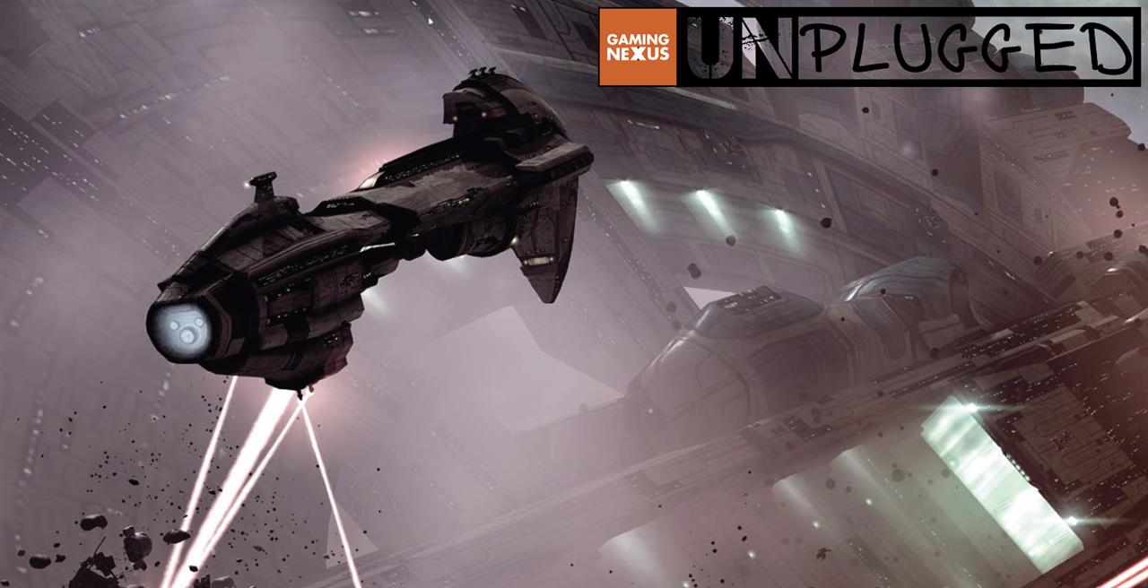
The redesigned Typhoon is the cover model on EVE Universe: The Art of New Eden. The Typhoon is a gnarly battleship. Looks kind of like a leech. Big mouth. Big teeth. Like it’d swallow you whole before it’d open up its dual repeating artillery cannons, thrashing you around the big black of space.
The Art of New Eden is 192 pages and 1,000 images of delicious EVE Online artwork. EVE Online, for the uninitiated, is a massively multiplayer online role-playing game. Launching May 6, 2003, the infamous “spreadsheets in space” science fiction video game is quickly approaching its 12th birthday. Developer CCP may not be riding the half-a-million-subscribers high it had two years ago in 2013, but EVE Online has always been in it for the long haul. Unlike most MMOs of the past decade, EVE never was a flash in the pan. Its numbers have slowly but surely gained ground almost every year since it launched in the early 2000’s.
This book covers a lot of ground. It looks at the artful evolution of EVE’s main characters—the spaceships themselves—as well as dramatized screenshots from in-game photographer Dead End Thrills; ground warfare stages for EVE’s sister game, first-person shooter DUST 514; internal shots of space stations, a concept that hasn’t fully materialized in-game beyond officers quarters; and even concept art for upcoming virtual reality stunner EVE: Valkyrie. A lot of ground.
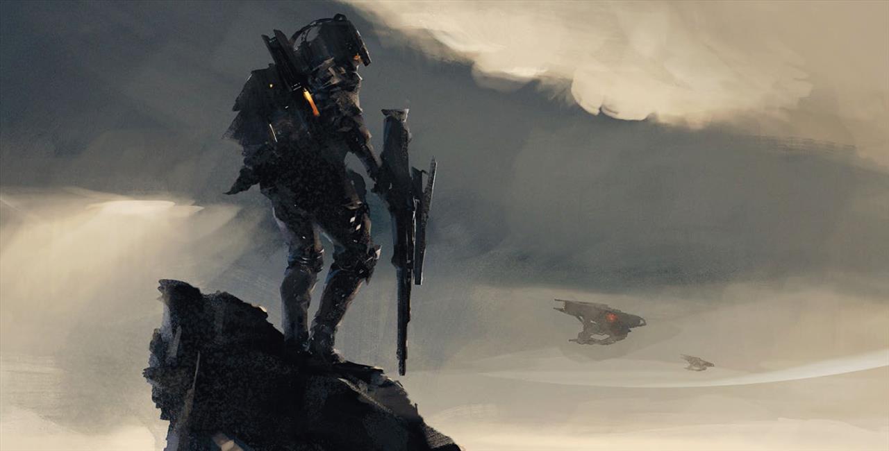
EVE Online takes up the most page real estate, of course, being the elder statesman of CCP Games. But the New Eden universe is big and getting bigger. Seeing EVE, DUST, and Valkyrie sharing the same space makes it apparent just how far CCP has been pushing its boundaries the last few years.
The book opens with some background, literally, of New Eden: It opens with the painterly nebulae that spread like an oil spill over the usual inky black of outer space. Well, there’s some cold, dark space out there, too, especially when you leave the security blanket of the inner stars and move further and further out into purely player-owned space. But your very first steps in EVE are greeted by painfully beautiful renditions of New Eden’s gas clouds, as you make your way around the game’s 5,000 solar systems.
Then The Art of New Eden brings in the starships. Sure, there is a scary-rich character creator in EVE, but let’s be honest, the game’s true character comes out in its spacecraft. Though you gain skills and abilities like any proper role-playing game, your true projection, your real face, manifests itself with these monolithic galaxy-faring ships.
There are four player races in EVE: Amarr Empire, Caldari State, Gallente Federation, and Minmatar Republic. Each race varies in the types of ships it pilots, at least initially. But those ships each have lines, figures, angles, and edges that create a visual distinction from the other races, and a visual cohesion within each race.
But we’re here for the pretty pictures.

CCP Games dug deep into its databases for these images. Some of them are pen and pencil sketches from as far back as 1999, when EVE Online was still just a twinkle in CCP’s eye. A few of these look like they were scribbled on a bar napkin at 2 a.m. after one too many whistle blows and tequila shots in some Tijuana dive bar. I’d hope that’s where some of these sketches come from, and I mean that in the most artistically supportive way possible.
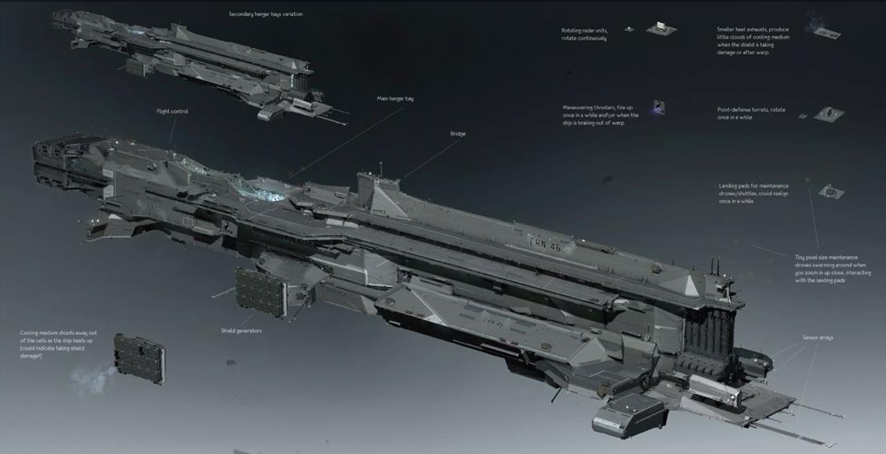
The asymmetry and bubbly contours and junkyard aesthetic of some ship designs take wonderful cues from visual futurists of the 1970s and ‘80s, like Moebius and Syd Mead. More recently, EVE is moving away from its initial asymmetrical designs and back into the easier-on-the-eyes balance of ship proportions. But that’s only to a certain extent. Many of these ships have blueprints as distinctive as Star Trek’s Enterprise or Star Wars’ Millenium Falcon. The apple-core angles of a titan Avatar, or the oversized tail section of a Caldari Scorpion, or the Decepticon-shaped Megathron, or even the half-transformed Gobot-looking Minmatar Rifter—all of these ships will become unmistakable, even if you’re only exploring EVE on a 30-day trial account.
Amarr ships are carved out to look like tools for religious sacrifice. Gallente ships have aerodynamic, art nouveau curves. Minmatar ships look like scrap heaps, but definitely hold their own. Caldari’s hard shapes draw most of their inspiration from real-world modern fighter jets and aircraft carriers. I’ve put some time into every race’s ships. Each comes with a unique enough beauty to make function over form a continually difficult decision.
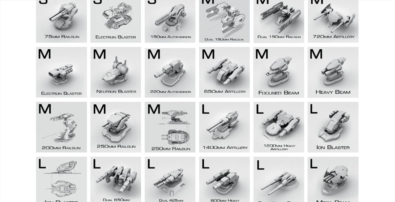
Then the artbook gets down to the nitty gritty in ship design by covering some of the hundreds of turret and missile launchers that populate these war platforms. Each one cuts a distinct silhouette, but it’s an overly obvious statement that their explosive effects overshadow their outlines.
Nearing the halfway point through The Art of New Eden, CCP trots out space’s constructs. They’re the natural and manmade objects you encounter, separate from the stars and planets and nebulae. And while there’s technically no “up” in space, EVE’s artists have a mandate to create objects as if there is an up. Because, in the editor’s words, “It looks good.” I tend to agree. Fly all the way around an object if you want, there’s nothing stopping you. But having objects anchored on a line that runs perpendicular to the orbital plane certainly does look good. As the artbook points out, “If it looks good, it’s good.” I can appreciate that level of gut instinct when it comes to art assets.
Next up: stations. These are the places a pilot can kick up their feet and call home. There are several duplicate designs across the galaxy in the stations you visit, sure. But each race’s stations also reflect the design philosophy involved in ship making. Caldari ships, for instance, look like they could be broken-off pieces of Caldari space stations. Same for the Amarr, Gallente, and Minmatar.
CCP mentions how they pursued, between 2006 and 2011, the idea of rendering station interiors. Letting you walk, for instance, from your captain’s quarters to the tech labs and marketplaces. Ultimately, however, time and resources ran out and CCP abandoned the idea as players asked instead that CCP focus more on ships and combat. You still get sleeping quarters to wander around in, but all of those other station functions, like ship repairs and recruiting offices, are all abstracted and handled in an online fashion—much in the same way we can buy everything from pizza to power tools on the internet today.
Personally, I’m okay with the decision to abandon the “walking in stations” initiative. Walking through big, long, spacious, possibly dull corridors doesn’t add much to gameplay, as far as I’m concerned. At least not in a game about internet spaceships. Even the captain’s quarters, strangely, can feel lonelier than outer space.
Then the artbook brings on the planets. Planets are sometimes the unsung heroes of EVE Online, but if you want to instantly step up your in-game photography, get a planet in the frame. It raises your image’s sci-fi score exponentially.
EVE and New Eden’s first-person shooter, DUST 514, share planets. You can be down on the DUST surface of a planet, ground pounding and popping caps, and see the same structures and coastlines that an EVE pilot can zoom in on from orbit. Where they will promptly send down an orbital bombardment.
The last quarter of the artbook introduces DUST and its spacious stages. They can look a bit soulless at times, but they’re still very sci-fi. The landscapes were not only inspired by pictures of Mars, but of—get this—CCP’s homeland of Iceland. In fact, CCP flew DUST’s Chinese art team into Iceland in order to study its topography and environments. Hey, if Iceland was a good enough location to film Prometheus, Oblivion, and Interstellar, then it’s good enough to inspire DUST.
And see, learning those kinds of factoids is an example of the real-world details I would’ve like to have seen populate more of this book. Yes, show me the sketches of ships. Show me the interior space station designs that didn’t make production. But give me the stories that inspired the artists. Give me a better idea of where these designers are coming from. That’s got to be at least half the reason I’d purchase an artbook in the first place. Show me their process.
I may be complaining simply because DUST’s environments are so bland, at least as far as the concept artwork is concerned. I’m not seeing much in any of these environments to help me distinguish it from any other generically rendered sci-fi world.
I like some of the honesty that goes into some pages, though. Like the space elevator, which was designed to be a bridge between DUST and EVE players. “The base of the space elevator can be seen in DUST 514 levels, while the top of the elevator is yet to be seen in EVE Online.” It’s subtle, but I can hear some of CCP’s aspirations and bottled-up frustrations seeping out in sentences like these.
The next 15 pages or so are dedicated to EVE: Valkyrie, the upcoming first-person space shooter using virtual reality technology. The cockpit is the character in Valkyrie, so a lot of energy has gone into giving each one a distinct feel.
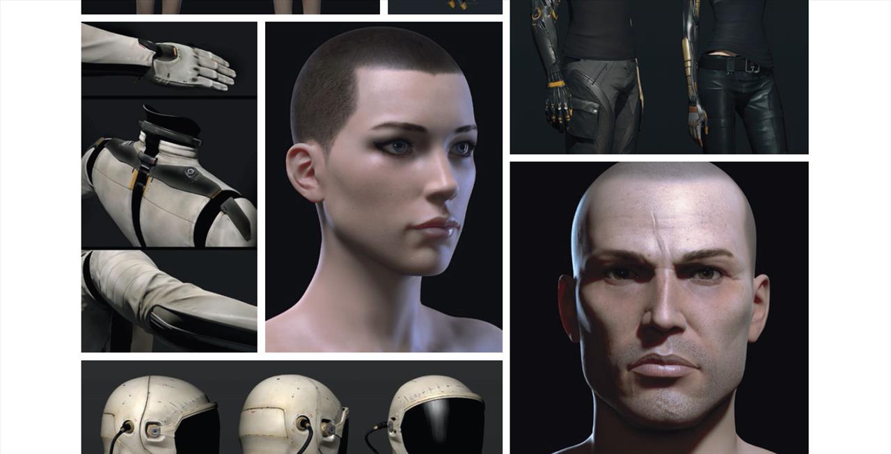
The last five pages are handed over to the character avatars in EVE. There’s not much said about them, or the process that went into creating them. Which is a shame, because that lack of attention reflects just how much individual avatars truly matter in a game like EVE. Which is to say, very little. As I said before, the ships are the main characters, not the pilots.
Aside from the sparse backstories and lack of creation myths going into The Art of New Eden, it’s a wonderful, somewhat cohesive look through EVE Online, DUST 514, and Eve: Valkyrie. The book often relies too heavily on the fact that it’s a supplement, and, more understandably, relies too heavily on big pictures with few words. There’s very little context, in other words. If you want pretty pictures, it's got pretty pictures. Anyone hungry to learn about the artistic process, however, will still be hungry by the end.
* The product in this article was sent to us by the developer/company.

About Author
Randy gravitates toward anything open world, open ended, and open to interpretation. He prefers strategy over shooting, introspection over action, and stealth and survival over looting and grinding. He's been a gamer since 1982 and writing critically about video games for over 20 years. A few of his favorites are Skyrim, Elite Dangerous, and Red Dead Redemption. He's more recently become our Dungeons & Dragons correspondent. He lives with his wife and daughter in Oregon.
View Profile